Cascading Style Sheets (CSS), stylesheet, styles
ON THIS PAGE
The Cascading Style Sheets Specification (CSS) is a computer language that is used to write formatting instructions (rules). These rules tell a web browser how webpage content should ‘look’— in terms of:
- layout
- position, alignment, width, height, etc.
- style
- typeface, font-weight, colour, border, etc.
As an example, all level-one headings can be set in the typeface Verdana and coloured red with the rule:
h1 {
   font-family: Verdana;
   color: red;
   }
The CSS language was created to meet the aesthetic demands placed on HTML: the computer language used to author webpages.
The CSS language specification(s) set out how rules can be written and should be implemented by web browser developers.
h1 {
font-family: Verdana;
color: red;
}Stylesheet
CSS rules are added to a webpage either by writing the code directly into the <head> of the webpage HTML, or by linking to a separate file.
A separate file containing only CSS rules is commonly referred to as a ‘stylesheet’, and has the extension .css (dot-C-S-S).
<head> of the webpage HTML, or by linking to a separate file..css (dot-C-S-S).The benefits of CSS
- Separation of content and presentation
- CSS rules can be provided in a file that is separate to the (content) HTML. If all pages link to this centralised CSS file, then the look of a website can more easily be updated. For example, the colour or size of all level-one headings can be changed by updating a single CSS rule.
- Smaller webpage file sizes
- As the code required to style content can be removed from individual webpages, the size of each webpage file is reduced. Depending on the benchmarks, file sizes may be reduced by up to 60%.
- Improved webpage download speed
- Once a stylesheet has been downloaded, it is typically stored on the user’s computer (cached). For each subsequent webpage viewed, only the HTML needs to be downloaded.
- Improved rendering speed
- Once a webpage has been downloaded, a browser processes the underlying code to determine how content should be displayed. This process is referred to as ‘rendering’. The time a webpage takes to render is affected by the complexity of the code the browser receives. Using CSS to control the layout of a page typically simplifies the the code structure making it ‘easier’ (faster) for the browser to render.
- Streamlined maintenance
- As less code is required for each webpage, both the likelihood of coding errors and time required to add content to a website are reduced.
- Changing presentation for different devices
- The CSS specification enables different rules to be used depending on the device used to access the web. For example, a different set of rules can be used to reformat a webpage for printing or viewing on a mobile phone.
- Accessibility
- Additional features can be added to webpages that provide ‘hooks’ for assistive technologies such as screen readers. (A screen reader is a program that reads aloud the interface to computer programs and computer-based content, including webpages). CSS-based techniques can be used to provide such hooks without impacting on the experience of mainstream users. For example additional headings can be added to content that will only be ‘seen’ by a screen reader. These headings can be used to provide additional contextual information that would otherwise be communicated by the visual design. As an example, the list of glossary terms at the foot of each glossary entry is preceded by the invisible heading: ‘Glossary Trivia’.
- Table-less layout
- Prior to the introduction of CSS, multi-column layouts could only be created using HTML tables. Unfortunately, at a code-level, a table used for layout purposes cannot be differentiated from a table used to mark-up tabular data (such as statistics). This has the greatest impact on technologies that ‘read’ webpage content at a code, rather than visual, level. If the meaning of content is affected by how it has been marked-up, then using a table for layout purposes has the potential to change the meaning of the content. Utilising CSS-positioning, layout can be achieved without compromising content structure or meaning.
- Customisation
- Advanced web browsing software enables the user to easily override the author-specified styles. Although admittedly requiring the user to know more about the mechanics of the web, content display can be completely customised.
- Search engine optimisation
- Search engines may assign greater relevance to content found first in the code, and/or limit the amount of content indexed on each page to a certain character-count. If content blocks are positioned using CSS, the order of webpage code does not need to match the display order. For example, the code for global navigation bars positioned at the top of the screen may come after the content in the source.
CSS Specifications: A moving target
As use of the web has changed, additional presentational requirements have been identified.
For example a webpage may be viewed using hand-held devices with screen sizes and proportions that differ to those of a computer monitor.
To keep pace with these and other changes in the way the web is used, the CSS specification continues to be revised and improved by the World Wide Web Consortium (W3C).
Each version of the language is referred to by a level number, with levels 1 and 2.1implemented by commonly-used web browsers (as at publication).
1 and 2.1implemented by commonly-used web browsers (as at publication).CSS rules
CSS rules are commonly referred to as ‘styles’.
A CSS rule comprises a selector, and a property:value pair (declaration).
- selector
- how content can be selected for styling
For example, the selector for a level-one heading element is h1; selectors include elementname, ID and class.
- property
- how a presentation attribute of an element can be targeted
For example, the font-family property refers to the typeface content should be set in.
- value
- the values permitted for each property.
For example, a colour can be set using a keyword: red, green, blue; or a hexadecimal code:#f00, #0f0, #00f.
A rule may contain a number of property:value pairs.
selector { property: value; }
           \_declaration_/
\___________ rule __________/
For example:
p {
  color: #c60;
  }

.warning {
  color: #900;
  font-weight: bold;
  }
CSS rules are commonly referred to as ‘styles’.
property:value pair (declaration).For example, the selector for a level-one heading element is
h1; selectors include elementname, ID and class.For example, the
font-family property refers to the typeface content should be set in.For example, a colour can be set using a keyword:
red, green, blue; or a hexadecimal code:#f00, #0f0, #00f.property:value pairs.selector { property: value; }
\_declaration_/
\___________ rule __________/p {
color: #c60;
}
.warning {
color: #900;
font-weight: bold;
}| Selector | Property | Value | Sample HTML Code | Result |
|---|---|---|---|---|
| p (element) | color | #c60 | <p>Sample text.</p> | Sample text. |
| .warning (class) | color | #900 | <h3 class="warning">Sample text</h3> |
Sample text
Style inheritance
…the ‘cascading’ in ‘Cascading Style Sheets’
Rather than write separate rules for each HTML element, global/parent rules can be used to style all nested/child elements. For example, in the structure of an HTMLdocument, text elements are nested inside of a <body>element. The typeface for all text elements can be set by styling the <body> element:
body {
  font-family: Verdana;
  }
The ability to style an element based on its position in the document structure is the ‘cascading’ in ‘Cascading Style Sheets’.
…the ‘cascading’ in ‘Cascading Style Sheets’
<body>element. The typeface for all text elements can be set by styling the <body> element:body {
font-family: Verdana;
}Specificity
The rule defined last, applied to the element closest to the content, or that uses the most specific selector, ‘wins’.
A RULE CAN BE REDEFINED BY A SUBSEQUENT RULE
p {
  color: #000;
  font-weight: bold;
  }

strong {
  font-weight: bold;
  }

p {
  colour: #c60;
  }
In the above stylesheet, the paragraph text colour is first set to black (#000) but then changed to orange (#c60) by the subsequent rule.
p {
color: #000;
font-weight: bold;
}
strong {
font-weight: bold;
}
p {
colour: #c60;
}#000) but then changed to orange (#c60) by the subsequent rule.A RULE APPLIED TO A CHILD ELEMENT WILL OVERRIDE A RULE APPLIED TO A PARENT ELEMENT
a:link {
  text-decoration: none;
  colour #900;
  }

p {
  color: #000;
  }
<p>
  Sample text including a <a href="index.html">hyperlink</a>.
</p>
Although the color of the p element is set after the a element rule in the stylesheet, the rule applied to the a element overrides the rule applied to the parent p element. The text ‘hyperlink’ will be red (#900).
a:link {
text-decoration: none;
colour #900;
}
p {
color: #000;
}<p>
Sample text including a <a href="index.html">hyperlink</a>.
</p>p element is set after the a element rule in the stylesheet, the rule applied to the a element overrides the rule applied to the parent p element. The text ‘hyperlink’ will be red (#900).A RULE WITH A MORE SPECIFIC SELECTOR WILL OVERRIDE A RULE WITH A LESS SPECIFIC SELECTOR
#content p {
  colour #900;
  }

p {
  color: #000;
  }
<div id="content">
  <p>
    Sample text.
  </p>
</div>
Although the last rule in the stylesheet sets the colour of p elements to black (#000), the selector that includes the parent div is more specific. The text ‘Sample text’ will be red (#900).
#content p {
colour #900;
}
p {
color: #000;
}<div id="content">
<p>
Sample text.
</p>
</div>
p elements to black (#000), the selector that includes the parent div is more specific. The text ‘Sample text’ will be red (#900).Default styles
Browser support for CSS
The CSS standard has been implemented, with varying degrees of compliance, since the release of Internet Explorer version 3 and Netscape Navigator version 4 browsers (circa 1998).
The variation in compliance with the specification(s) is often the Achilles’ heel of CSS. As newer, more compliant, browsers are released, webpage designers/developers rely more-and-more onCSS to achieve their designs. This can result in a webpage that has been authored to the CSSspecification, but if viewed using a non-compliant browser appears to be ‘broken’.
Three Types of CSS
CSS comes in three types:
- In a separate file (external)
- At the top of a web page document (internal)
- Right next to the text it decorates (inline)
External style sheets are separate files full of CSS instructions (with the file extension .css). When any web page includes an external stylesheet, its look and feel will be controlled by this CSS file (unless you decide to override a style using one of these next two types). This is how you change a whole website at once. And that's perfect if you want to keep up with the latest fashion in web pages without rewriting every page!
Internal styles are placed at the top of each web page document, before any of the content is listed. This is the next best thing to external, because they're easy to find, yet allow you to 'override' an external style sheet -- for that special page that wants to be a nonconformist!
Inline styles are placed right where you need them, next to the text or graphic you wish to decorate. You can insert inline styles anywhere in the middle of your HTML code, giving you real freedom to specify each web page element. On the other hand, this can make maintaining web pages a real chore!
CSS Instructions
Before we introduce CSS, let's briefly review HTML. A simple web page is made of tags. Everything must go between the opening and closing <html> tags. The <head> section contains invisible directions called meta information. The <body> section is where we put all the visible stuff. Here's a super simple HTML example:
Simple

External CSS
Now here is a short, simple example of CSS using an external file (we'll call it 'stylish.css'). We're going to tell our web page to be white and to make our h1 heading, noted in our simple HTML example as 'John Adams', appear in red at 24 units high:
CSS Code as a Separate, External File

In the sample file, the top line is a comment and doesn't do anything. The next part (called body) tells the web page what background color to use for thebody section. Right after that, the h1 part says we want our largest heading (h1) to be the color red and its font size to be 24 units high.
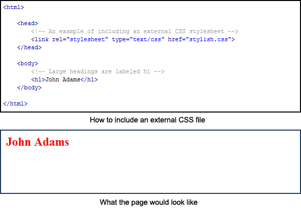
Now, to include this external CSS file ('stylish.css'), we have to include a link for it within the <head> section of our blank web page, as shown on screen:
How to Include External CSS
Internal CSS
We don't need to include an external CSS file just to decorate one web page. We can just define our styles at the top of the page, in the <head> section. Here's a quick example in which we're making our heading (h1) blue at a font size of 28 px:
Internal CSS Example

Inline CSS
Before we introduce CSS, let's briefly review HTML. A simple web page is made of tags. Everything must go between the opening and closing <html> tags. The <head> section contains invisible directions called meta information. The <body> section is where we put all the visible stuff. Here's a super simple HTML example:
|
External CSS
Now here is a short, simple example of CSS using an external file (we'll call it 'stylish.css'). We're going to tell our web page to be white and to make our h1 heading, noted in our simple HTML example as 'John Adams', appear in red at 24 units high:
|
In the sample file, the top line is a comment and doesn't do anything. The next part (called body) tells the web page what background color to use for thebody section. Right after that, the h1 part says we want our largest heading (h1) to be the color red and its font size to be 24 units high.
Now, to include this external CSS file ('stylish.css'), we have to include a link for it within the <head> section of our blank web page, as shown on screen:
|
Internal CSS
We don't need to include an external CSS file just to decorate one web page. We can just define our styles at the top of the page, in the <head> section. Here's a quick example in which we're making our heading (h1) blue at a font size of 28 px:
|
Inline CSS
No comments:
Post a Comment